
Your Sense system has been set up, and whether you’ve used it a lot or are just getting started, now seems a good time to make sure you’re familiar with the variety of information the Sense Home app provides. Your home’s power consumption and usage activity are reported by Sense to help you answer a range of questions – clearly, instantly, and in real time.
In this post, we’ll look at the app’s five main screens.
- Now – a real-time tally of every watt your home is using
- Dashboard – see your spending month-to-date and what you’re trending towards
- Meter - see the real time map of your home’s usage overall, and watch it change as devices go on and off
- Devices – individual usage statistics and information for individually discovered devices.
- Settings – account info, appearance, Wi-Fi configuration, integrations, and much more
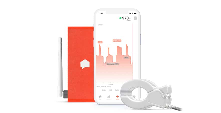
What’s on right Now
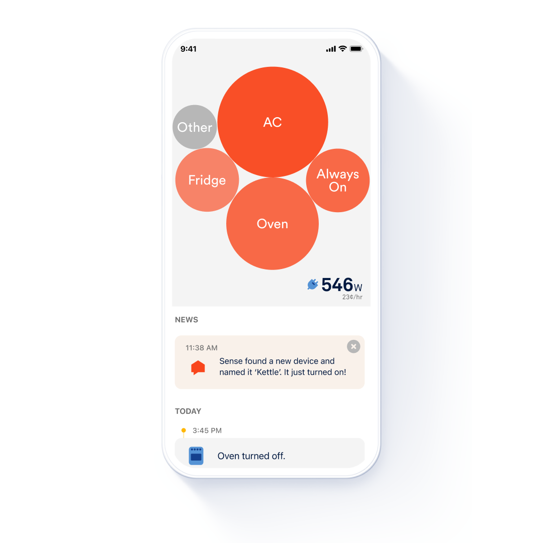
The Now screen is likely the one you’ll be checking most often – it’s the quick-to-read snapshot of your home’s activity. It will change over time, as more devices are detected.
You’ll see usage plotted as a bubble graph, with bubble size relative to power consumption. Bubbles appear for each device that’s been detected. You’ll also see your Always On load, which accounts for phantom loads that seem to always be on, like DVRs, printers, Wi-Fi speakers, and desktop computers that consume a small amount of power in “standby” mode, and a bubble for Other, which represents the usage for devices whose signature hasn’t yet been identified. When you first begin to use the app, you might only have one or two bubbles shown, but that number will grow over the coming days and weeks as Sense analyzes your home energy usage and identifies more device signatures. In the bottom right corner you’ll see a real time measurement of how much wattage your house is using.
At the top of the timeline listing, if you’ve allowed it, you may see notifications about a significant change in your home’s usage. These changes are often easily explained by shifts in weather or household activity, but you can learn a lot as you come to understand the impact of such changes.
Scroll through the timeline on the bottom half of the Now screen lists identified devices as they turn on or off. Tap a device to get its detailed usage information and statistics, and to give names to devices Sense has identified but needs your insight to properly name. The detail view lets you see how much an individual device or appliance contributes to your usage numbers overall. You may choose to set up a notification for an individual device, as it turns on or off or if it operates for more than a set amount of time. All this can help you track – and reduce – inefficient use.
Analyze your energy use
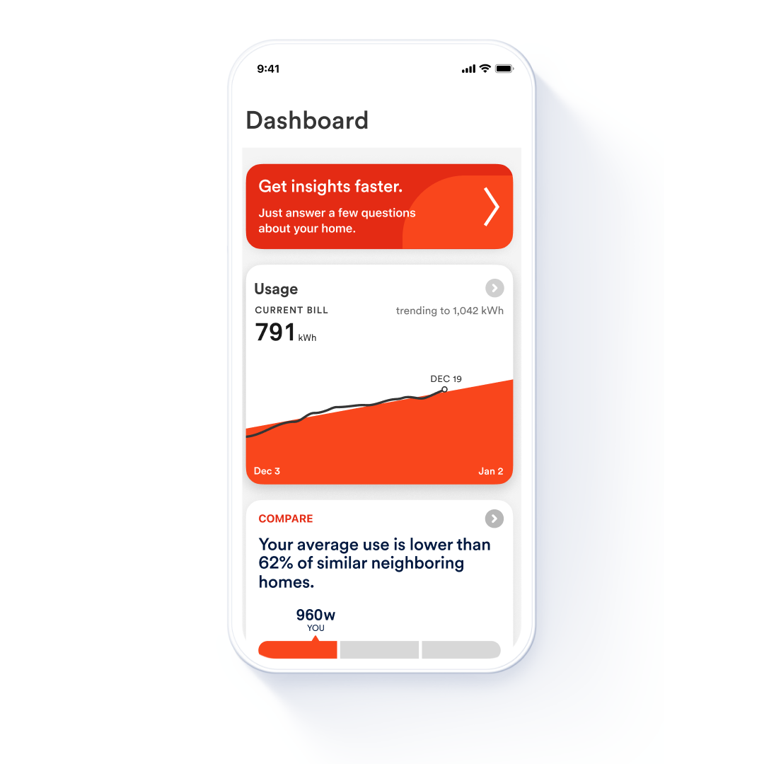
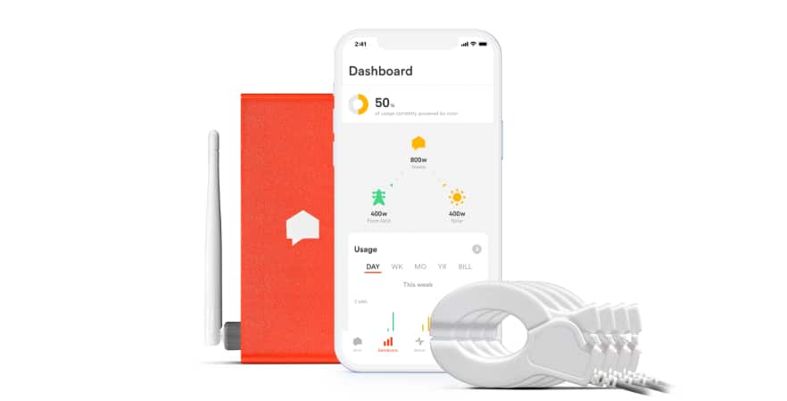
The Dashboard screen makes it easy to see how your home is consuming energy over time. The info provided is both aggregated and divided by devices, and can be configured to show information for a range of time periods.
Usage
The Usage card, at top, shows how your usage is trending for the month and helps you anticipate the charges that will be added to your monthly bill. Tap on the card to dig into this usage information. You can track how much energy your home is using by the day, week, month. year, or billing cycle (if you’ve defined your billing dates in the Settings screen). By default, you’re seeing total energy use for your whole home, but you can also click on individual devices to see Dashboard for that device with estimated costs. The usage presents both kWh and dollars for a particular day.
This detail can be very helpful if you’re trying to shift usage to take advantage of off-peak utility rates during other parts of the day. Or, if you have solar, to better sync up your consumption with your energy production, like charging your EV in the middle of the day when solar generation is at its highest. You’ll notice that the statistics for each device also change as you modify the viewing range.
Compare
Return to the top of the Dashboard (there’s an arrow in the top left), and you have a Compare card, which helps you see how your home’s usage compares to similar homes. Again, tap the Compare care for more detailed information and measurements, and for an expanded range of comparisons. For more information on these comparisons, see this article.
Watt Check
The Dashboard card also includes Watt Check, which is a handy tool for measuring how much energy (and resulting cost) is necessary to run certain appliances or devices in your home. Watt Check is not related to device detection, but it can be a very useful tool for you in identifying inefficient appliances or lights, or understanding where you might want to plan for upgrades that help save down the road.
Watt Check is intuitive to use, so just press “get started” to measure usage in lights, space heaters, fans, dryers, power tools, vacuums, and toasters. The interface will walk you through the steps to test one or several tools. This article explains it all.
Carbon
Under Dashboard you also find a Carbon report that helps you understand the carbon intensity of your weekly usage, including a listing of how your utility has combined resources, and in what percentages, to provide the energy your household used. These measurements allow you to estimate the environmental impact of the kWh your utility provider has generated to make electricity, information you may choose to use as you work to lower your home’s impact on carbon usage. Learn more about how to use the carbon intensity feature here.
Goals
Goals is an important area of the Dashboard, as this is where you can create your own goals. After you’ve perused the dashboard reports, you may have a better idea of what your household may want to do to conserve energy. And with that insight, you can set specific goals. You may decide to target inefficiencies or define thresholds for your home’s use of energy … and then you can let the app help you track your home’s progress on those goals.
To set goals, you can target Always On and overall usage goals, and if you have Sense Solar you can set goals for that as well. In setting goals, you can define various periods of time, including day, week, month and cycle. This article tells you how.
Labs
Labs are just that, experimental sections where Sense is testing and validating certain kinds of data to see if they can be added as standard features in the future.
The big picture, minute by minute!
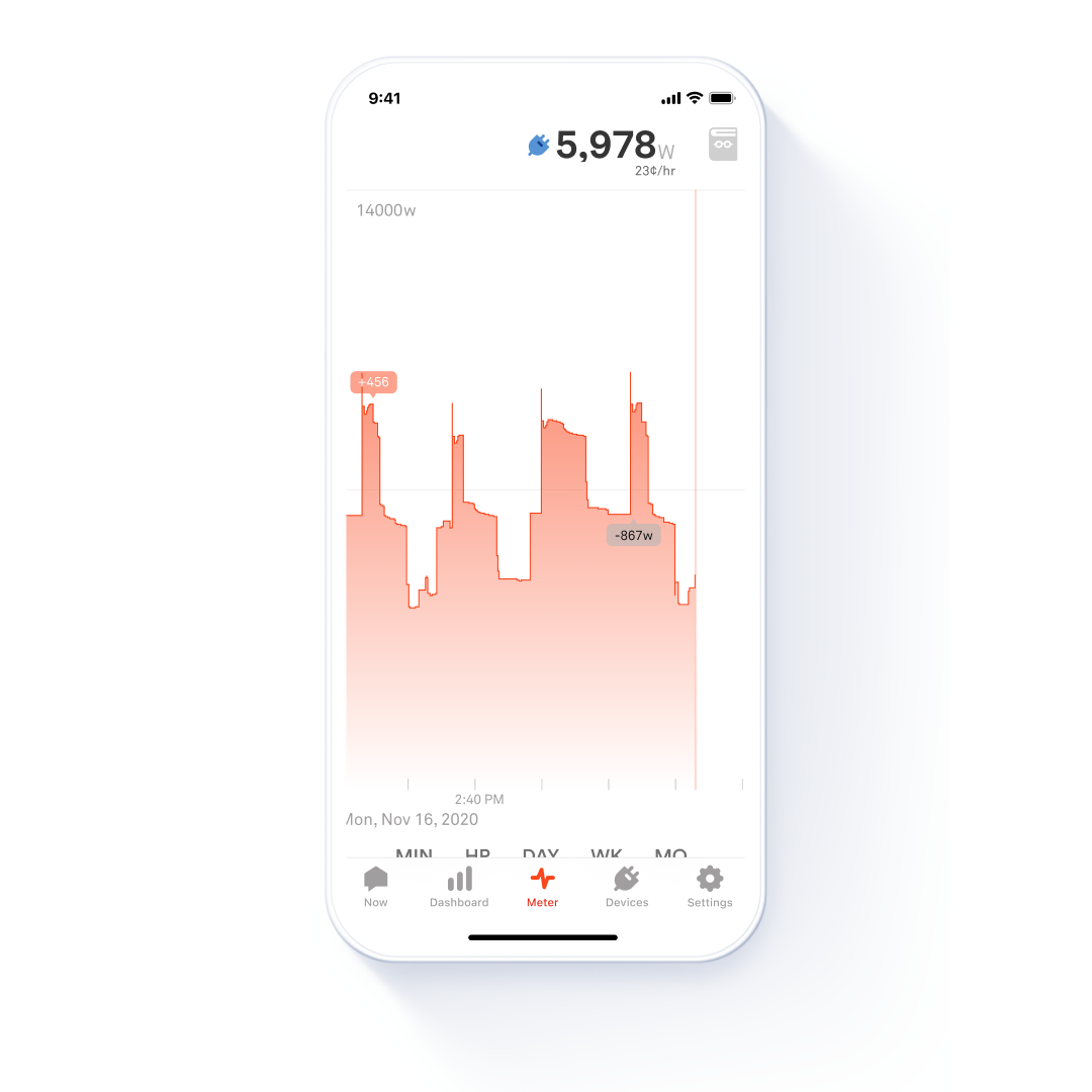
The Meter graphic offers a detailed real time representation of what’s on right now right down to the sub-second level. This is where you can see some of the particular signatures that each device has when it turns on or off. Sense detects devices by identifying these signatures and other unique qualities in the context of your home. This view is also valuable in showing that your home is often a very busy place electrically, which is why device detection may take weeks as the system isolates one signature from an overlap of many signatures operating at once.
Sense will need some time to learn your home and its most significant devices. Some small devices, or those used only intermittently, may not be identified. But even before Sense discovers the primary devices in your home, it’s easy to see how much energy they consume just by turning them on and off and watching the Power Meter in real time.
Use your fingers for this report. Scroll left to see past activity. Pinch with two fingers to zoom out (or back in).
Note that you can also zero on specific time periods to see the meter minute by minute, or by the hour, day, week, or month. This may also help you define goals that you record under the Dashboard feature.
Where is the action?
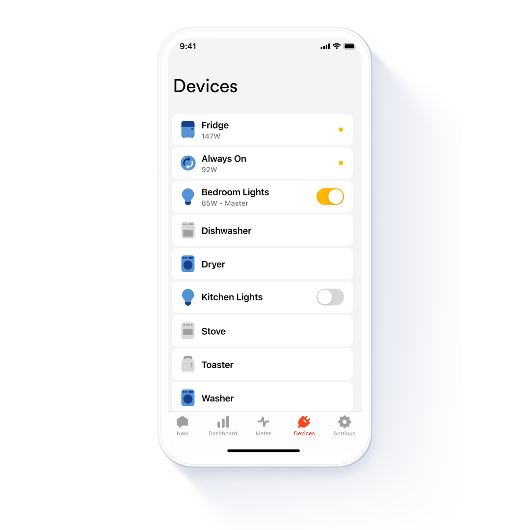
The Devices screen gives you a bird’s-eye view of all the devices that have been discovered in your home, listed first by what is currently on, and then alphabetically after that. If devices are currently turned on, the app colors them blue. In the first few weeks after installation, this list may be limited, but the longer your Sense system operates, the more devices Sense will learn and the longer this list will grow (and the smaller your Other bubble will become).
By tapping on any device name, you get to detailed views and see historic usage statistics for that device. The app provides an average measurement of how much power the device consumes when it’s on, and estimates the cost over a year, based on your usage. But move down to the usage card here for views of that device on a weekly, monthly, annual, or bill cycle basis. If you’ve listed a device in your survey that Sense is still working to identify, the app may provide information on how that device (a fridge, for example) tends to operate on average, so that you can estimate cost while you await its explicit identification.
When Sense discovers a device, it awaits your help to accurately name that device. Sense presents you with a list of Community Names, which leverages crowd-sourced data to give you insights into what other Sense users have named similar devices. You’ll want to use these historical data clues and your knowledge of your home’s appliances to help pinpoint what the device actually is, then name it and fill in its details in the app.
If you tap the gear icon in the top right of the screen, you can add the make and model information. By doing this you’re also helping to contribute to the accuracy of the Community Names feature, and helping the Sense data science team build its database of device signatures, in turn improving detection accuracy for the entire user community. This Details tab also includes fields for information unique to your home, like the location, and personal notes like “Filter changed 01/01/23” to help you stay organized and up-to-date with appliance maintenance.
Getting the details right
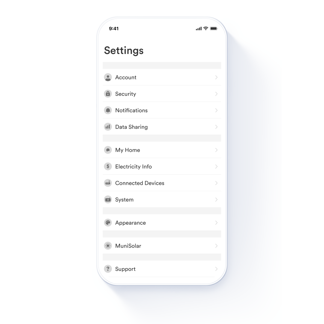
The last main screen inside the Sense app is Settings, where you’ll find a long list of fields that you can customize to define how Sense works for you.
Under the Account tab is where you can select what kinds of notifications you want to receive, including push and email notifications relating to particular device activity. You can also define your security preferences.
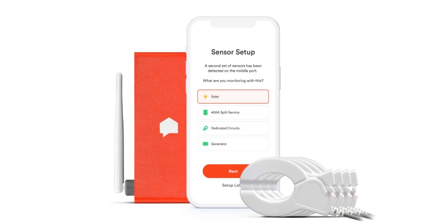
At My Home, you’ll define the details of your home to help with the “similar homes” comparison. You can also define electricity info such as billing cycles and rates, including Time of Use rate zones, if those apply in your area. Here is where you also add information on integrations (connected devices like smart plugs or Alexa) and otherwise define your network connection info. And if you need your serial number, you’ll find it in the System report along with a lot of information on the signals your Sense system receives. This is also where you will go if you ever need to reset your data.
You can also use the setting menu to change the appearance of your Sense screen, to contact the Sense Support team, or to ensure you are using the latest version of the app.
Web App
For the cherry on top, don’t forget that your Sense can also be accessed from your desktop web browser via the Sense Web App. While the Web App can do almost everything the mobile app can do, it also offers some unique features, like the ability to export your Sense data for further processing (spreadsheet or external app).
Whether mobile or Web, the Sense app is your dashboard for what’s going on (and off) in your home. Take some time, explore its features, and get a better understanding of your power usage. Have a suggestion to improve the Sense monitor or app? Be sure to reach out to our support team here. And check out Sense Saves to see how others are saving with Sense.