Sense Labs Inc, hereafter “Sense”/”we”/”us”, was built from the ground up with the privacy of your data in mind. Keeping your data secure, and in your control, is central to how we run our company and how we build and sell our product. Most importantly, we believe that your data belongs to you, and that it is confidential. We use best-in-class practices and technology to keep it private and secure. We will not share it with others unless you have given us permission to do so, or we have anonymised and / or aggregated it such that your information is not personally identifiable.
Our Privacy Policy lays out what data we collect, how we use it, and what your rights are. If you have any questions, please let us know at privacy@sense.com.
We process your personal data in accordance with the overarching principles and requirements set out in the in the General Data Protection Regulation and the Data Protection Act 2018 (‘Data Protection Law’). What this means is that we process your data in a way that is:
- Lawful, fair and transparent;
- Compatible with the purposes that we have told you about;
- Adequate and necessary, we only use the data we need to use for the reason we told you;
- Accurate and up to date;
- Not excessive, we only keep your data for as long as we need it; and
- Secure and protected.
Terms not defined herein are defined in the Sense Terms & Conditions ( https://sense.com/legal).
How do we collect your personal data?
Personal data is information that can be used to directly or indirectly identify you, such as your name, location, or an online identifier. We collect personal data about you from various sources including directly from you, from your use of the Sense monitor and application and we may collect data from some third parties.
We will only use your Personal Data for the purposes for which we collected it, unless we reasonably consider that we need to use it for another reason compatible with the original purpose. If we need to use your Personal Data for an unrelated purpose, we will notify you and we will explain the legal basis which allows us to do so.
What Personal Data do we use?
Contact data. If you purchase a product from our Site, we will process your name, email address, billing and shipping address, and (optionally) your phone number, for the purpose of processing your order, payment and delivery of your Sense monitor. Our basis for processing your data in this way is that it’s necessary to fulfil our contract with you.
Note: Sense does not collect your payment data. All payments are processed by a third party on behalf of Sense. If you pay using PayPal, their Privacy Policy is located here: https://www.paypal.com/us/webapps/mpp/ua/privacy-full . If you pay by entering your credit card information directly to the Sense store, your payment is processed by Shopify, whose Privacy Policy is located here: https://www.shopify.com/legal/privacy
Account data. When you register with Sense to create an account and download the Sense application we will process personal data including your name, address, email address, phone number and username and password and we’ll use this data to send you information related to your account, including confirmations, invoices, technical notices, updates, security alerts, and support and administrative messages. Our basis for processing this data is also contract as we use this data to provide you with Services.
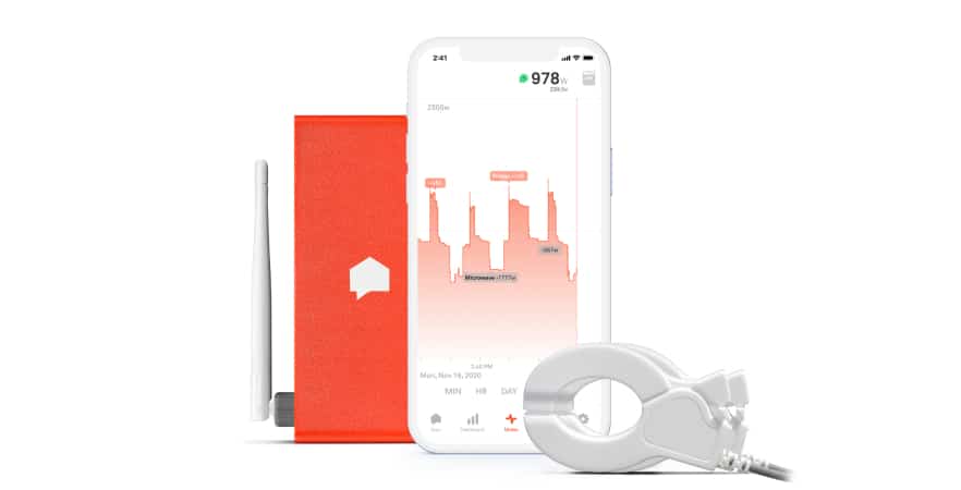
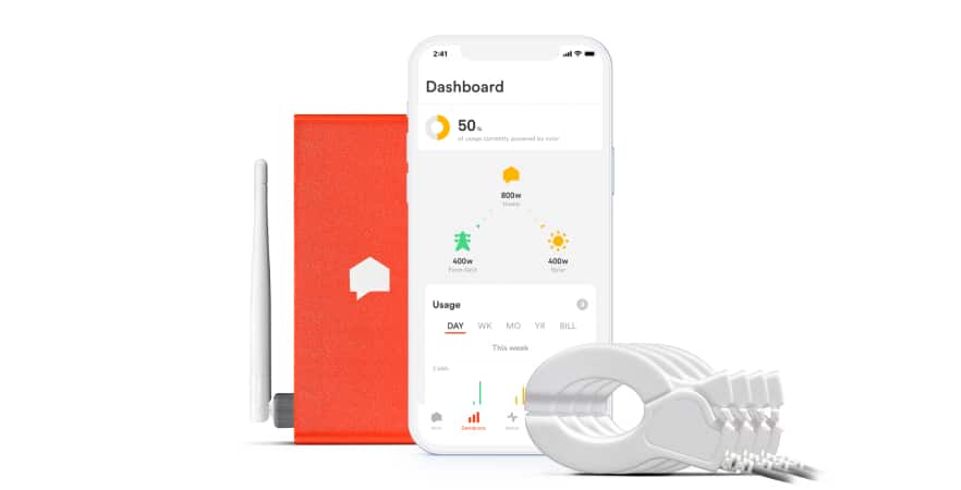
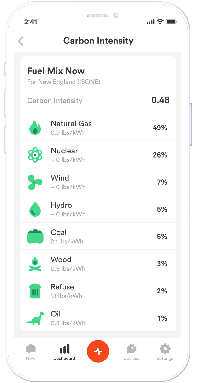
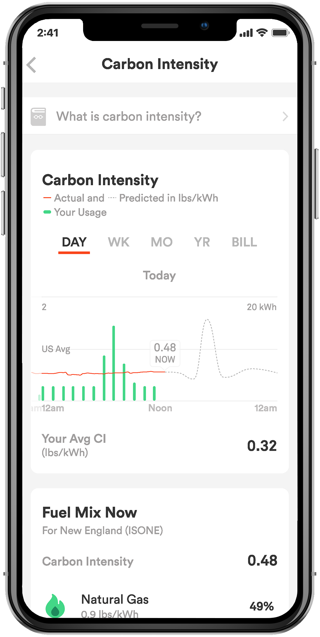
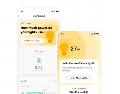
Product Data. The Sense monitor collects detailed data about the usage of electricity through the electrical panel in which it is installed. Your Sense monitor will collect data about your household appliances such as your fridge and any personal electronic devices you connect to the monitor, including detailed wattage and voltage information, and uses this data to generate hypotheses about specific devices in use. This information is used to provide you with information specific to your house, like a summary of device usage over time, or comparative information relative to others. A subset of this data is sent to our servers, where it is stored. These servers are located in the USA and we have put in place EU approved standard contractual clauses as an appropriate safeguard for the transfer of data to a country outside the EEA.
When providing our service to you, we use this data to identify opportunities for you to improve the efficiency of your home, such as ways to reduce electricity consumption, or identifying devices that are running inefficiently or may be failing. We gather consumption data and process it using artificial intelligence to create a customised virtual model of your home. We also send you alerts that you have enabled, which notify you that a device that has finished running (like a dishwasher) or that has been left on for an extended period of time (like a stove). Our basis for processing this data is contract as it is required for us to provide you with Services. Service Data. The Sense Application collects various information at setup time, and in the course of usage, namely location data to set your time zone and to enhance product operations (for example, to correlate to weather); application usage information to monitor customer experience; and crash and error information for improving application experience.
Direct Marketing Data. When you create your account with us, we ask you to set your marketing preferences to confirm whether you consent to receiving marketing materials from Sense. We will also ask you if you agree to us sharing your information with third party marketing agencies we work with. You may instruct us to notify you by email, push notification or text and we will communicate with you in this way. Our basis under law for processing your personal data in this way is consent.
You may opt out of receiving promotional messages from us by following the instructions in those communications. If you opt out, we may still send you non-promotional messages, such as service emails about your accounts or our ongoing business relations.
You may also send requests about your contact preferences and changes to your information including requests to opt-out of sharing your personal information with third parties by emailingprivacy@sense.com.
General Website Data. We collect information about you in various ways when you use the Site. We collect personal information including your name, email address, and other information you provide via the Site when you submit inquiries or request more information about our Product and Service.
When you visit our Site, some information is collected by us about your computer’s operating system, Internet Protocol (IP) address, access times, browser type and language, and the Site you visited before our site are logged. Our basis under law for processing this data is legitimate interest.
Cookies. We may collect information using “cookies.” Cookies are small data files stored on your hard drive by a Site. Some cookies are essential for our Site to function properly but others are non-essential and allow us to collect data which we can use to help us improve our Site and your experience. Cookies enable us to collect information about your usage and activity on the Site to help us to understand your preferences and to enhance your experience and enjoyment when using our Site, Product, and Service.
We may also use cookies to gauge your usage, conduct research and diagnostics to improve the content we provide you, our products and services, to help us analyse general web traffic to our Site, and to improve our campaign effectiveness.
Third Party Cookies. We may use tools offered by third party services, such as Facebook, to send data about actions users take on our site and to place Sense ads on other websites you may visit. These third-party services may use set cookies to provide measurement services to Sense on our advertising campaigns or to target ads. You may disable the targeting advertising features by following the instructions at https://www.criteo.com/privacy/. Web Beacons. We may collect information using Web beacons. Web beacons are electronic images that may be used via the Service or in our emails. We use Web beacons to deliver cookies, count visits, understand usage and campaign effectiveness and to tell if an email has been opened and acted upon.
Our basis for processing data generated from the use of non-essential cookies is that we have your consent. If you no longer want us to use cookies in your web browser, you can remove them from your computer or change your browser settings so that it either blocks cookies altogether or asks you if you’d like to accept them from some websites.
Third Party Applications. We may link to certain third-party Sites and applications, such as Facebook and use the personal information we get from these third parties, to help understand your needs and provide you with better service. Your use of our Site is subject to this Privacy Policy and our Terms & Conditions. If you click on a link to another Site or application from our site, the third-party Site may also impose its own terms and conditions and privacy policies on your activities on their site. Our basis under law for processing this data is legitimate interest.
Sharing of Your Personal Data. We may share your personal data with third party vendors, consultants and other service providers who work for us and need access to your information to do that work. Where third parties process data on our behalf, they won’t use your personal information for their own purposes and we only permit them to use it in accordance with our instructions and the law.
We may share anonymised data relating to your energy consumption to energy companies who will use this data for the purpose of introducing enhanced time of use tariffs, demand side response services, grid health monitoring and control.
We may also share additional information with home insurance and home services companies so they can provide proactive and predictive maintenance services and smart insurance cover. This data is anonymised and cannot be used to identify you OR We will share information with these parties if you provide us with your consent to do so.
We may share your personal data as necessary to (i) comply with laws or to respond to lawful requests and legal process, (ii) to protect our rights and property and that of our agents, customers, members, and others including to enforce our agreements, policies and terms of use or (iii) in an emergency to protect the personal safety of any person. We may also share your personal data in connection with or during negotiation of any merger, financing, acquisition, or dissolution, transaction or proceeding involving sale, transfer, divestiture, or disclosure of all or a portion of our business or assets to another company.
How long do we keep your data for? We will only keep your data for as long as we need to for the reason we have collected it. If you close your Sense account, we will keep your data for a reasonable period of time to enable us to fulfil our legal and regulatory obligations.
Security of your Personal Data. We have put in place appropriate technical and security measures to protect your personal data against loss, misuse, and unauthorised access, disclosure, alteration, and destruction.
Transfers of Personal Data Outside the EEA. Sense may store and process personal information in the United States and other countries which may have data protection rules that are different from those of your country. We ensure that we have appropriate safeguards in place to support the transfer of your data outside the EEA.
Your Data Protection Rights. You have a number of rights under data protection law in relation to your personal information and if you want to exercise any of these rights, please contact us at privacy@sense.com and we’ll be happy to help. These rights are as follows:
- right to request access to your personal information - you can request a copy of the personal information we hold on you;
- right to request correction of your personal information - if any personal information we hold on you is incorrect, you can request to have it corrected;
- right to request erasure of your personal information - you can ask us to delete your personal information in certain circumstances;
- right to object to processing or restrict processing of your personal information - you may object to our processing of your personal data in certain circumstances;
- right to request the transfer of your personal information - to provide you, or a third party you have chosen, with your personal information; and
- right to withdraw consent – where we process your data on the basis of consent, you can notify us that you want to withdraw consent any time.
Changes to this Policy. We may change this Policy from time to time. If we make any changes to this Policy, we will change the “Last Updated” date below and publish the updated version on or Site. If we make an important change that we need to tell you about, we’ll email you to let you know.
Questions about this Policy. If you have any questions about this Policy or to access personal information we may have of yours, please contact us at privacy@sense.com
or by writing to:
Privacy Officer
Sense Labs, Inc.
485 Massachusetts Avenue
Cambridge, MA 02139
If you have any data protection complaints, you may contact the Information Commissioner's Office (ICO) by post at Information Commissioner’s Office, Wycliffe House, Water Lane, Wilmslow, Cheshire, SK9 5AF. Email: casework@ico.org.uk Telephone: 0303 123 1113
We’d like to try and help with any concerns you may have before you contact the ICO, so please get in touch with privacy@sense.com in the first instance.